
Introduction
When I first started coding, the world of web development appeared big and frightening. One of the most transforming moments in my learning journey was mastering Flexbox in CSS. Flexbox, or the Flexible Box Layout Module, changed the way I approached layout design, making it more efficient and visually appealing. This is a detailed explanation of my experience using Flexbox and how it helped me improve my skills as a web developer.
Discovering Flexbox
I started with the fundamentals of HTML and CSS, building simple web pages and learning how to style them. However, when I worked with more complicated layouts, I discovered that typical CSS positioning methods such as floats and inline blocks were laborious and limiting. It was then that I discovered Flexbox, a CSS3 layout concept intended to make complicated layouts easier to handle.
The Initial Learning Curve
Flexbox’s plethora of new attributes and concepts initially appeared daunting. Terms like flex container, flex items, main axis, and cross-axis were unfamiliar to me. However, using a disciplined approach, I gradually began to comprehend the fundamentals:
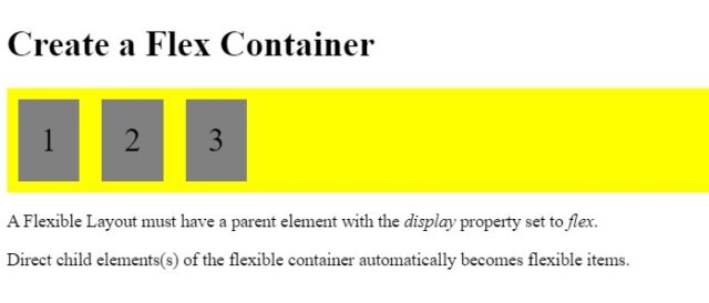
Flex Container and Flex Items: I learned that setting display: flex on a parent element turns it into a flex container, making its children flex items. This simple change opened up a world of layout possibilities.
Main Axis and Cross Axis: Understanding that Flexbox operates on a main axis (horizontal by default) and a cross axis (vertical by default) was crucial. This helped me grasp how items are aligned and distributed within the container
Practical Application and Experimentation
With the basics in place, I started experimenting with various Flexbox properties. I created small projects to practice and understand how each property affected the layout:
- flex-direction: By manipulating the main axis with
row,row-reverse,column, andcolumn-reverse, I could control the direction of the flex items. - justify-content: This property allowed me to align items along the main axis. I loved how
space-between,space-around, andspace-evenlyprovided different spacing options for flex items. - align-items: Aligning items along the cross-axis became straightforward with values like
center,flex-start,flex-end, andstretch. - flex-wrap: Creating responsive layouts was easier with
flex-wrap, which lets items wrap onto multiple lines.
Real-World Projects
As I became more familiar with Flexbox, I began using it on real-world applications. One of the first tasks was to revamp my portfolio website. Using Flexbox, I was able to develop a responsive grid layout that adapts effortlessly to different screen sizes. Here’s an example of the CSS code I used in the layout:
.container {
    display: flex;
    flex-direction: row;
    flex-wrap: wrap;
    justify-content: space-between;
    align-items: center;
}

.item {
    background-color: lightblue;
    padding: 20px;
    margin: 10px;
    flex: 1 1 200px; /* Grow, shrink, and basis */
}
This simple yet powerful layout made my website look professional and function smoothly across devices.
You can click here for a visualization
Challenges and Solutions
Flexbox simplified many areas of layout design, but it was not without its obstacles. One notable problem was dealing with vertical centring, which has always been difficult with standard CSS. Flexbox’s align-items: centre attributes elegantly addressed this by aligning objects vertically within the container.
Another problem was to ensure compatibility with outdated browsers. Most recent browsers support Flexbox, although some older versions do not. Using Autoprefixer, a technology that automatically adds vendor prefixes, allowed me to ensure greater compatibility.
Reflecting on My Journey
In retrospect, understanding Flexbox was a watershed event in my coding journey. It not only simplified my approach to web design, but it also opened up new avenues for developing responsive, modern designs. Experimentation, practice, and real-world application were all part of the journey from perplexity to mastery.
Flexbox has become an essential tool in my web development arsenal. It allowed me to construct more dynamic and versatile layouts, which improved both my talents and my confidence as a developer. If you’re on a similar path, I highly recommend exploring Flexbox. Embrace the learning curve, experiment with attributes, and watch your ability to create beautiful, responsive websites increase rapidly.
Good luck coding!